Visayan Forum
Date:
April 2016
Client:
Visayan Forum Foundation
(Voice of the Free Foundation)
Visayan Forum Foundation is an organization and a front-liner when it comes to fighting against human trafficking in the Philippines. Their mission focuses on ending slavery and other forms of human exploitation and abuse.
Despite the success, they’ve continued to focus on the operational side of the campaign against human trafficking. Ever since, they kept themselves busy on the ground. At this stage, they’d like to bring their experiences and knowledge across and raise awareness about giving care, protection, and education to the abused victims, especially the young ones.
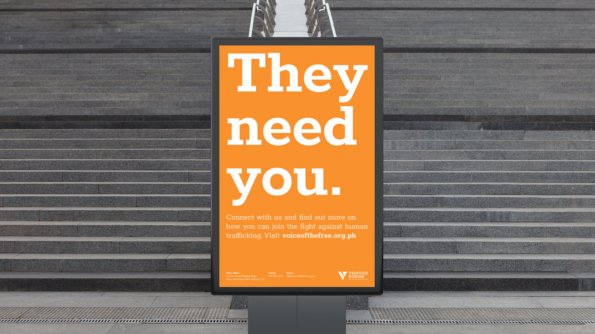
They needed support in conducting programs and campaigns to better communicate their mission and vision, as well as to share with the public the solutions to the problem. They needed support to build up their presence and communication strategy in order to establish their organization to the masses and to gain more supporters and volunteers, especially from the youth.
It was an honor to be a part of this project, along with the team of volunteers from Canva to help and create a significant impact. I was in a group that focused on revamping and improving their brand identity which is also a part of the communication strategy created by the Canva team for the organization. This exploration is just one of my contributions to the project the team worked on for them. Kindly note that this design is not officially used by Visayan Forum. I chose to still work on improving it just in case they’ll be needing to update their identity in the future.
Visayan Forum is now called Voice of the Free
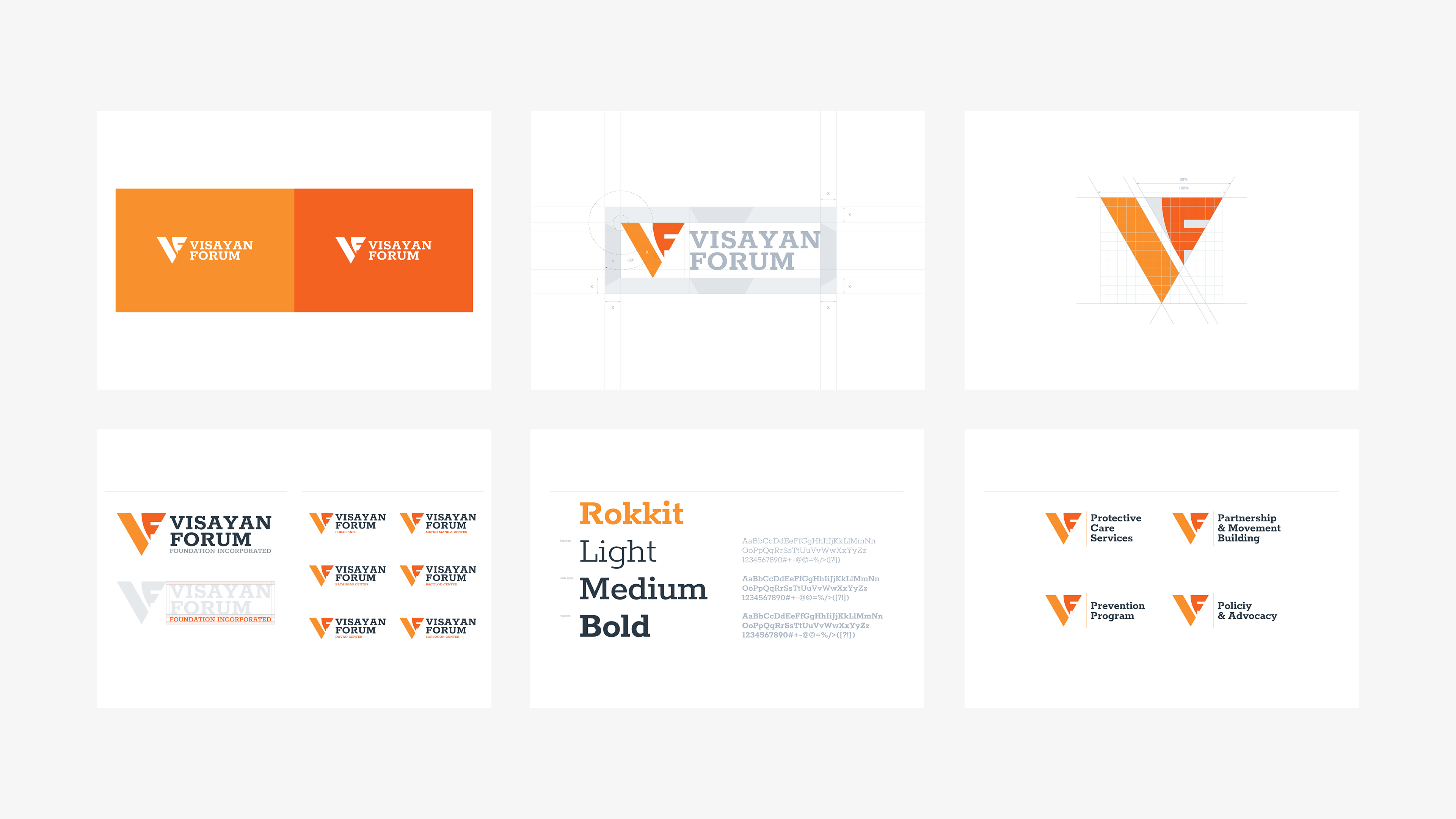
The organization’s first logo featured a key representing the victims’ freedom from human trafficking. While the key element conveys an important message, it does not fully capture the organization’s mission and vision, which is to protect and empower victims, helping them explore opportunities and build resilience. Visually, the old logo does not function well, especially in more modern applications or situations.
I believe a simpler and more distinctive symbol is needed. Such a design would create better retention for the public, making it easier for people to recognize and remember the organization’s identity or at least its name. Additionally, a simpler logo will perform better in different contexts, regardless of where it appears.
I introduced a new idea to better represent the organization’s mission and vision. I used a dove as the main symbol since it also signifies freedom. Additionally, the dove symbolizes hope, love, and protection—values that Visayan Forum upholds. The dove can be compared to the victims’ journey towards freedom.
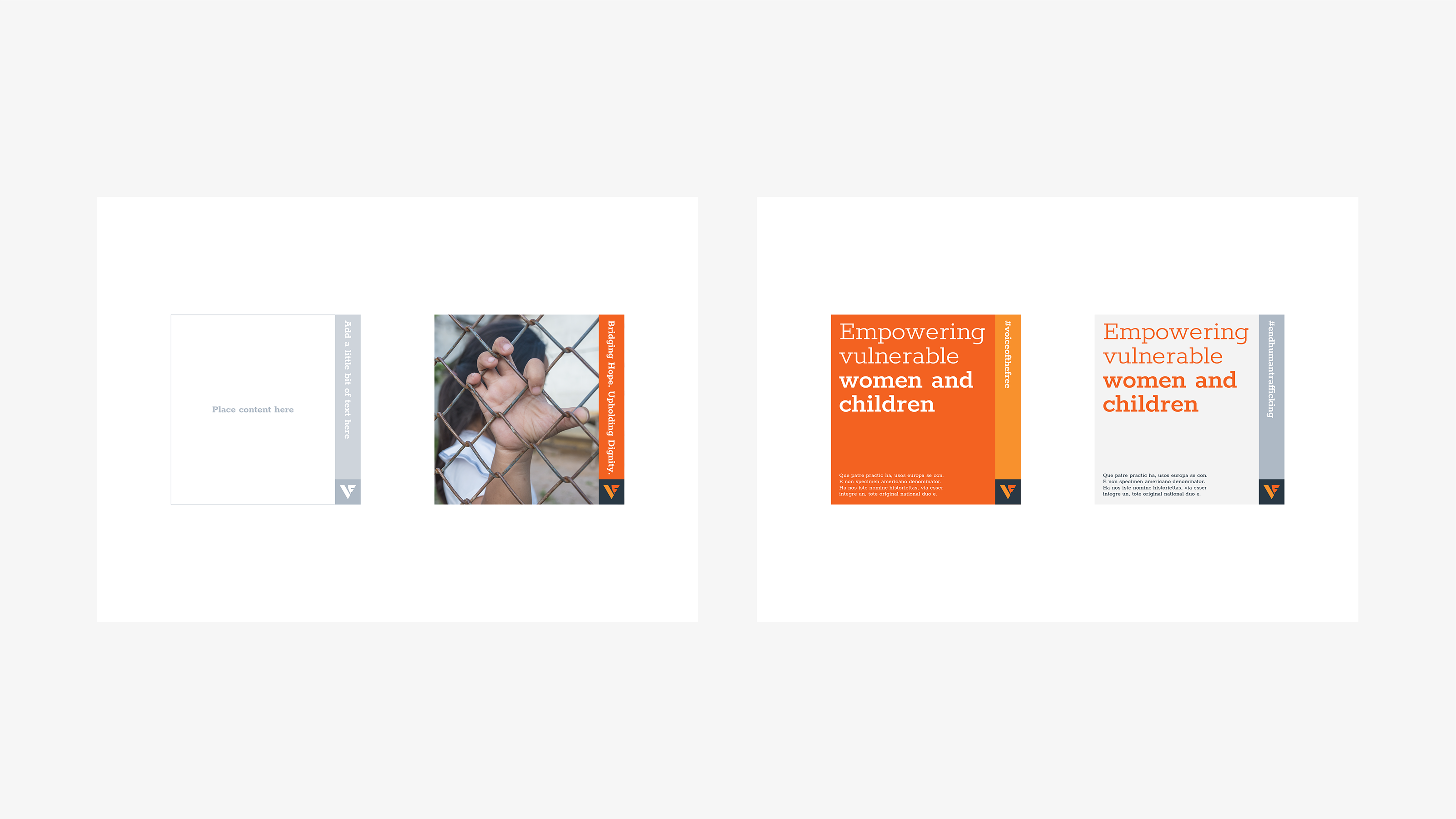
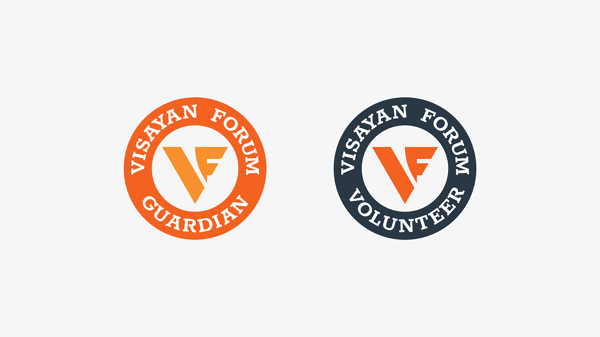
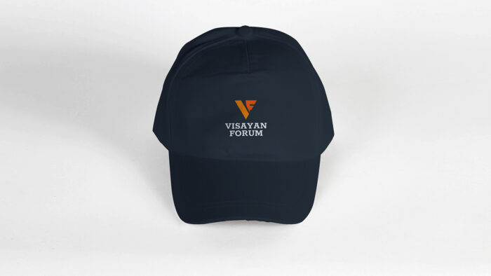
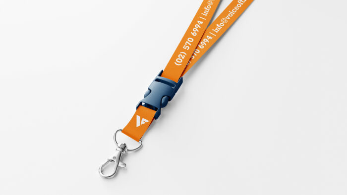
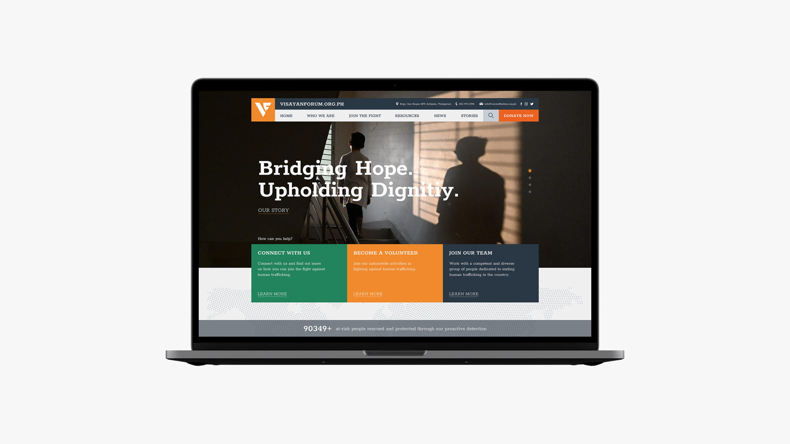
To create a distinctive mark, I combined the initials of the organization, V and F, to form a dove. This design makes it easier for people to remember the organization’s name. I made the form of the symbol plain and simple to enhance recall, especially among the youth. For the wordmark, I selected a bold slab serif typeface that stands out and catches attention.


I decided to come up with a mark that is bold and strong. Something more symbolic than illustrative. I wanted to show how brave, serious and determined they are with their mission. I aimed for this mark to represent all these qualities and serve as their badge or flag in their journey.

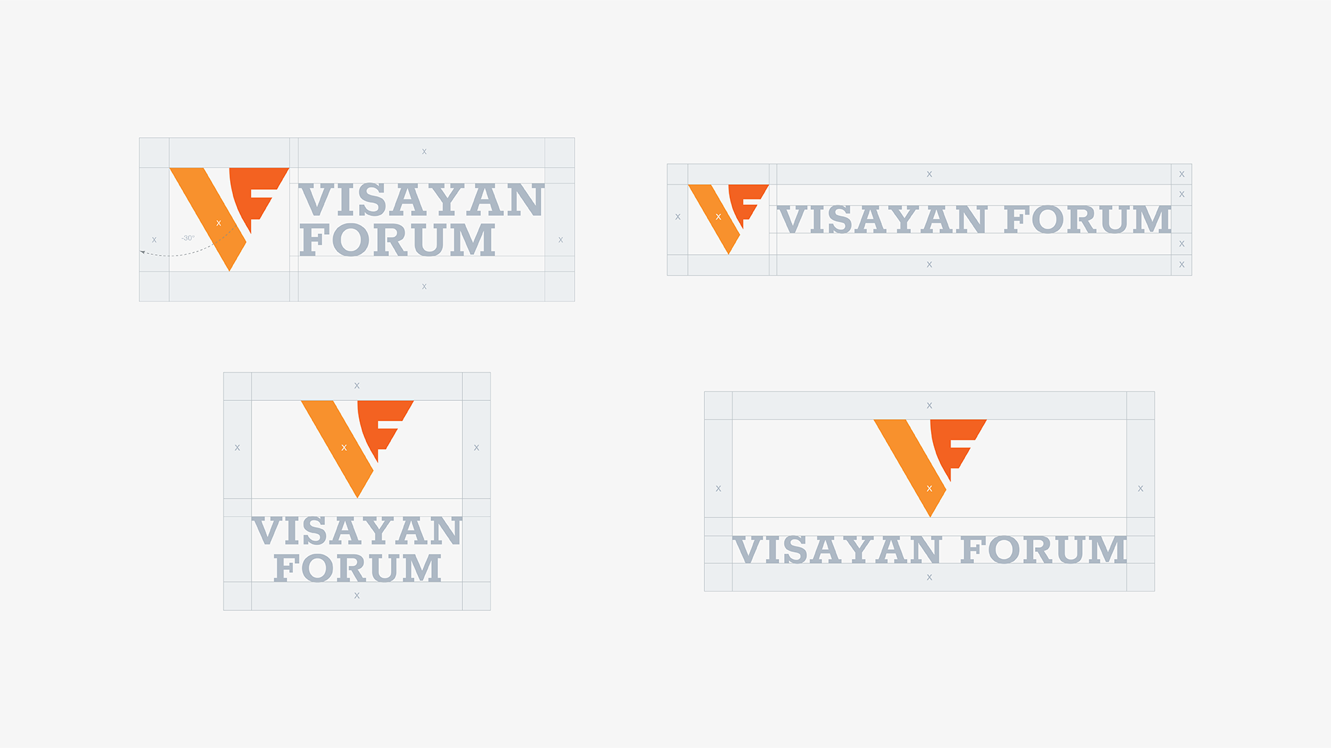
The Visayan Forum Foundation was founded in 1991. I believe this is the perfect time for them to have a strong mark to represent and honor everything they have overcome and achieved through the years. Something that can last further over the coming generations. An uncomplicated mark that can grow within their organization and also with the people.

Visayan Forum’s main brand colors are light orange and light green. With the revamp that I made, I retained the same colors with little adjustments on the values to make them look stronger and richer. Because of this, it will be easier to match them with either lighter or darker colors. I made orange as the primary color and added a new one from the same shade. This balances the graphical synthesis and the typography that forms the mark. I made green an accent color and I also added a dark, desaturated blue to make it look neutral and easy to match the stronger colors in the palette. I added this color as it symbolizes security and trust.
